News Markers on the Chart
Learn how to read the scatter dots on the chart — every analyzed article visualized as a color-coded point on the sentiment timeline.

Three Types of News Overlays
The SentiSignal chart can display individual news articles as scatter dots overlaid on the sentiment and price data. There are three toggleable overlay types, each serving a different purpose.
1. News Points LLM
Every article that received an LLM (AI) sentiment analysis is plotted as a dot:
- X-axis position: The article's publication time
- Y-axis position: The LLM sentiment score (-1.0 to +1.0)
- Color: Gradient from red (negative) → yellow (neutral) → green (positive)
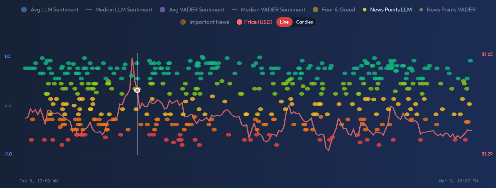
This view reveals the distribution of individual article scores within each time period. Where the aggregate sentiment lines show the average or median, these dots show you every data point that went into that calculation.
2. News Points VADER
The same visualization, but using VADER sentiment scores instead of LLM scores. VADER often produces more extreme scores (closer to -1.0 or +1.0) because its rule-based approach responds strongly to sentiment-laden vocabulary. Comparing LLM and VADER scatter patterns can reveal interesting discrepancies — for example, VADER might rate a headline as very negative due to words like "crash" or "plunge," while the LLM reads the full context and rates it more neutrally.
3. Important News
A filtered subset showing only articles with an importance_score of 0.5 or higher (as rated by the LLM). These are the articles most likely to have market impact — major regulatory announcements, partnership deals, earnings surprises, macroeconomic data releases.
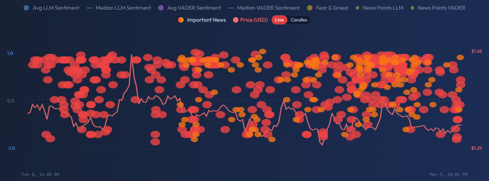
Important News dots are larger than regular news points, making them easy to identify. They are also clickable — clicking a dot opens a modal with:
- Article title and snippet
- Per-asset sentiment scores (how the article scored for each relevant symbol)
- Quality, credibility, and importance scores
- Published time
Display Limits
To prevent the chart from becoming unreadable with too many dots:
- News Points LLM/VADER: Maximum 500 dots displayed per view
- Important News: Maximum 200 dots displayed per view
If more articles exist in the selected period, the most recent ones are shown. For longer time periods (90d+), consider using a coarser granularity to reduce density.
Practical Use Cases
Spot Sentiment Clusters
A cluster of green dots appearing before a price rise is a strong visual signal that positive news flow preceded the move. Conversely, a cluster of red dots before a price decline suggests the news caught the sentiment shift early.
Identify High-Impact Events
Use the Important News layer to find the specific articles behind major sentiment swings. When you see the sentiment average jump from -0.2 to +0.5, the important news dots will show you which articles drove that change.
Cross-Engine Comparison
Toggle between LLM and VADER news points for the same time period. If LLM dots cluster around +0.3 but VADER dots show +0.7, it may mean the headlines are very positive (VADER catches that) but the full article content is more nuanced (LLM catches that). This discrepancy is itself useful information.
Divergence Detection
If the sentiment average line is rising but the most recent news dots are mostly red, the average may be lagging — new negative articles haven't yet pulled the aggregate down. This "dot vs line" divergence can be an early warning signal.
For more on how sentiment leads or lags price, see Leading and Lagging — When Sentiment Predicts Price.