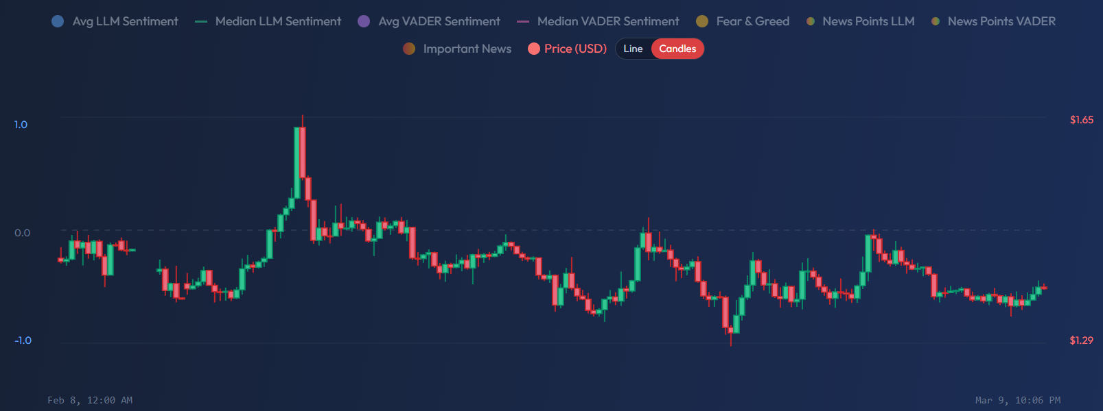
Candle vs Line Mode
Switch between line and candlestick price display to focus on sentiment correlation or price action analysis.

Two Ways to View Price
The SentiSignal chart offers two modes for displaying price data: Line mode and Candlestick mode. You can switch between them using the toggle button above the chart. Each mode serves a different analytical purpose.
Line Mode (Default)
In line mode, the price is displayed as a single continuous line connecting closing prices across each time bucket. This is the default because it produces the cleanest visual comparison with sentiment lines.
Best for:
- Seeing the overall price trend without visual noise
- Comparing sentiment direction with price direction — do the lines move together?
- Identifying sentiment-price divergences where sentiment rises but price stays flat (or vice versa)
- Quick at-a-glance assessment of correlation
When your primary goal is understanding whether sentiment and price are aligned, line mode keeps the focus on direction and trend.
Candlestick Mode
Candlestick mode displays traditional OHLC (Open-High-Low-Close) bars, primarily using Binance klines data for crypto assets.
Reading Candlesticks
- Green candle = Bullish: the close price is higher than the open price. The asset gained value during that period.
- Red candle = Bearish: the close price is lower than the open price. The asset lost value.
Candle Anatomy
- Body — The thick part of the candle. It represents the range between the open and close prices. A long body indicates strong directional movement.
- Wick (shadow) — The thin lines extending above and below the body. They represent the high and low prices reached during the period. Long wicks indicate price was rejected at those levels.
Candlestick Patterns to Watch
When combined with sentiment data, candlestick patterns become more powerful:
- Doji (tiny body, long wicks) — Indecision. If sentiment is strongly bullish during a doji, watch for a potential breakout.
- Hammer (small body at top, long lower wick) — Potential reversal from bearish to bullish. Stronger signal if sentiment is also turning positive.
- Engulfing (large candle that "engulfs" the previous candle) — Strong reversal signal. If a bullish engulfing candle appears alongside rising sentiment, the setup has higher conviction.
When to Use Each Mode
- Line mode — When your focus is the sentiment-price relationship. The cleaner visual makes it easier to spot whether the lines are moving together or diverging.
- Candlestick mode — When you want to analyze price action in detail: intraday volatility, reversal patterns, and support/resistance levels.
Most SentiSignal users start with line mode to assess the sentiment landscape, then switch to candlestick mode when they want to zoom into specific price events and see how volatility patterns align with sentiment spikes or drops.
For more on the data series available on the chart, see Chart Legend: LLM vs VADER, Average vs Median.