Chart Legend: LLM vs VADER, Average vs Median
Understand every data series on the sentiment chart — what each line represents, when to use average vs median, and how to toggle layers.

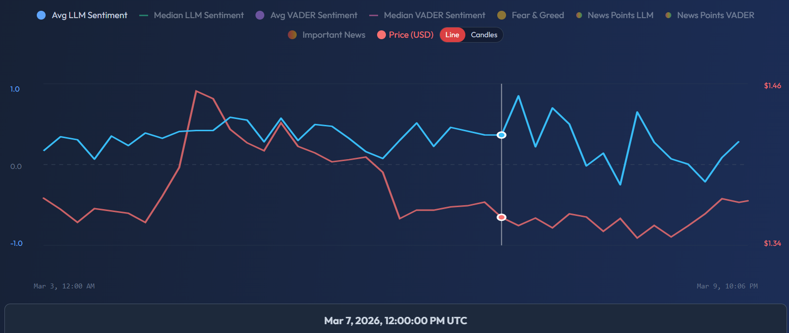
Eight Data Series, One Chart
The SentiSignal sentiment chart can display up to 8 toggleable data series simultaneously. Each series is color-coded and can be turned on or off via the chart legend. Understanding what each one represents is essential for accurate analysis.
Sentiment Lines
Avg LLM Sentiment — Blue Solid (#38bdf8)
The average of all LLM (AI language model) sentiment scores within each time bucket. This is the primary sentiment indicator and the best starting point for most analysis. It reflects the overall tone of all analyzed articles.
When to use: Default for most analysis. Shows the general direction of AI-assessed sentiment.
Median LLM Sentiment — Teal Dashed (#10b981)
The median LLM sentiment score. Unlike the average, the median is resistant to outliers. If one extremely viral article with a sentiment of +1.0 or -1.0 dominates a time period, the average will be pulled toward that extreme, but the median will remain stable.
When to use: When you suspect a single high-profile story is skewing the average. Compare average and median — if they diverge significantly, investigate which articles are causing the gap.
Avg VADER Sentiment — Purple Solid (#7c3aed)
The average VADER (rule-based NLP) sentiment score. VADER is faster and free to run, but less context-aware than the LLM. It excels at detecting clearly positive or negative language but can miss sarcasm, nuance, and domain-specific meaning.
When to use: As a "second opinion" signal. If both LLM and VADER agree on direction, the signal is stronger. If they diverge, it is worth reading the underlying articles to understand why. Learn more about the differences in What Is VADER and How It Differs from LLM.
Median VADER Sentiment — Pink Dashed (#ec4899)
The median VADER sentiment score. Same outlier-resistance logic as Median LLM, but for the VADER engine.
Price
Price — Red (#f87171)
The asset price in USD, displayed as either a line chart or candlestick chart depending on your selected mode. The price uses the right Y-axis (auto-scaled with 5% padding), while sentiment uses the left Y-axis (-1.0 to +1.0).
Read more about switching between modes in Candle vs Line Mode.
Fear & Greed
Fear & Greed Index — Amber (#f59e0b)
The Crypto Fear & Greed Index on a 0–100 scale, displayed on a separate Y-axis. This is a crypto-only indicator and will not appear for commodity or forex assets. For a full breakdown, see Fear & Greed Index — What the Levels Mean.
News Scatter Dots
News Points LLM / VADER
Each dot represents a single analyzed article, plotted at its publication time on the X-axis and its sentiment score on the Y-axis. The dots use a gradient color: red (negative sentiment) → yellow (neutral) → green (positive sentiment).
These scatter dots help you see the distribution of individual articles, not just the aggregate line. A tight cluster of green dots suggests broad consensus; a scatter of red and green dots reveals divided sentiment.
Important News
A filtered subset showing only articles with an importance_score ≥ 0.5. These dots are larger than regular news points and use the same gradient coloring. They highlight the highest-impact articles — major announcements, regulatory decisions, earnings reports — that are most likely to move markets.
Learn more about how to use these markers in News Markers on the Chart.
Axis Layout
- Left Y-axis: Sentiment scale from -1.0 to +1.0
- Right Y-axis: Price in USD (auto-scaled with 5% padding above and below the visible range)
- X-axis: Time, based on your selected period and granularity
Practical Tips
- Start with just Avg LLM Sentiment + Price turned on for the clearest view.
- Add Median LLM when investigating outlier-heavy periods.
- Toggle VADER on to cross-check — agreement between engines increases confidence.
- Use Important News dots to identify specific events that caused sentiment spikes.