How to Interpret the Homepage
Understand every section of the SentiSignal homepage — from the hero chart to the sidebar widgets.

The Homepage at a Glance
The SentiSignal homepage is designed to give you a comprehensive market sentiment overview in a single screen. It features a hero section at the top, a main content area (left two-thirds), and a sidebar (right one-third) packed with real-time sentiment widgets.
Hero Section
The hero area displays a featured sentiment chart (ETH by default) along with platform-wide statistics:
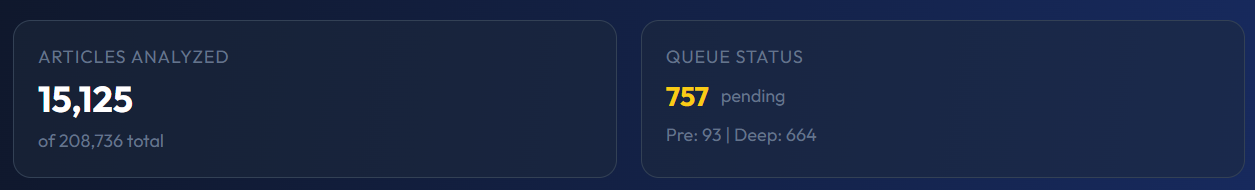
- 130,000+ news articles analyzed to date
- 180+ news sources monitored continuously
- 3 asset classes covered — Crypto, Commodities, and Forex
This gives visitors an immediate sense of the platform's scale and the richness of the data behind every sentiment score.
Section Navigation
Below the hero, a navigation bar lets you jump between the main content sections:
- Articles — AI-generated in-depth analysis pieces
- Briefs — Short AI-written market summaries
- Analysis — AI chart analysis cards
- Experiments — SentiLab statistical experiments
- Sources — News source directory and leaderboards
Main Content Area
The left two-thirds of the page displays the primary content:
In-Depth Analysis Articles
AI-generated long-form articles provide deeper analysis of market trends, combining sentiment data with price action and macro context.
Sentiment Experiments
Featured SentiLab experiments are showcased here — for example, correlation sweep results that reveal whether sentiment is currently leading or lagging price for popular assets.
AI Chart Analysis Cards
Automated chart analysis combines visual pattern recognition with sentiment overlays, generating written insights like "BTC sentiment has been rising for 3 days while price remains flat — potential breakout setup."
Sidebar Widgets
The right one-third of the page contains real-time widgets:
Top Sentiment Movers
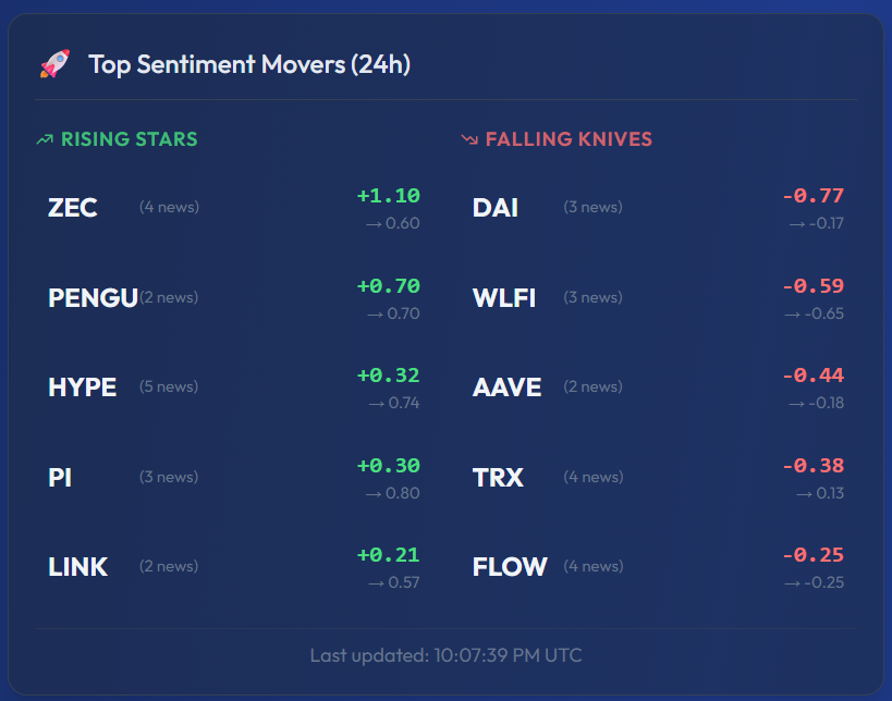
This widget highlights the assets with the biggest sentiment changes in the last 24 hours. It is split into two columns:
- Rising Stars (left column, green) — Assets whose sentiment improved the most. In the screenshot above you can see ZEC jumping +1.10, PENGU +0.70, and HYPE +0.32.
- Falling Knives (right column, red) — Assets whose sentiment declined the most. Here DAI dropped -0.77, WLFI -0.59, AAVE -0.44.
Each entry shows the symbol, the news count (small number next to the name), the sentiment change (large green or red number), and the current absolute sentiment (smaller number below). A timestamp at the bottom confirms when the data was last refreshed. This is one of the fastest ways to spot which assets are seeing unusual sentiment shifts.
Market Briefs
Short, AI-written summaries for each asset class. Each brief includes a sentiment label — bullish, bearish, or neutral — giving you a quick read on the overall market mood.
News Sources
Quick links to explore individual news sources and their historical accuracy and sentiment patterns.
Popular Assets
Buttons linking to the most-visited asset pages, making it easy to jump directly to BTC, ETH, GOLD, or EUR/USD.
Putting It All Together
The homepage is your sentiment command center. A typical workflow might look like:
- Check the Top Sentiment Movers to see what is moving today.
- Click into a mover to view its sentiment vs price chart.
- Read the Market Brief for a quick narrative summary.
- Browse the latest Articles to find in-depth analysis on assets driving sentiment.
- If something looks interesting, run a SentiLab experiment to test whether the pattern is statistically significant.
Next up: dive into the core visualization — How to Read the Sentiment vs Price Chart.